Component library
Reusable tokens and components. Every value comes from getComputedStyle
measurements taken on the source site (see _capture/source-*.json).
Colours
Palette measured on the source home page. The dominant ink is rgb(20,15,15), not #000.
--ink
#140f0f
Primary ink (rgb 20,15,15) — not pure black
--muted
#757575
Secondary text
--muted-light
#919191
Tertiary text
--surface-1
#f9f9f8
Alternate surface 1
--surface-2
#f4f3f2
Alternate surface 2 (bars, placeholders)
--surface-3
#efeeec
Alternate surface 3
--line
#d8d6d3
Rules and borders
--sale
#c8102e
Soldes / Fins de séries
--link
#3860be
System links and focus
Typography
One family for the whole site: Saans, the source font, served locally. It exposes intermediate weights the site actually uses (380, 570, 670, 790).
--fs-hero · 72px
--fs-section · 64px
--fs-xl · 40px
--fs-lg · 28px
--fs-md · 24px
--fs-sm · 18px
--fs-base · 16px
--fs-xs · 14px
--fs-2xs · 12px
Radii & spacing
The source is overwhelmingly pill-shaped (1000px), with 4px on product imagery and 8px on panels.
--r-pill
1000px
--r-tile
4px
--r-panel
8px
--r-lg
20px
Buttons
48px-tall pill, medium weight, no uppercase. The --onImage variant is used on heroes and banners.
<button class="btn btn--primary">AJOUTER AU PANIER</button>
<button class="btn btn--secondary">Voir les meilleures ventes</button>
<button class="btn btn--onImage">Sur photo</button>
Badges
Small spaced caps, placed above the product name — not on the image, contrary to a common assumption.
Colour swatches
16px circle in the grid, 32px on the product page. The selected state is a double ring.
Size selector
48px square, thin border, inverted when selected, struck through when sold out.
Product card
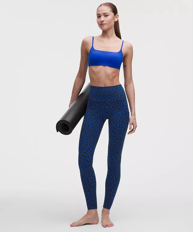
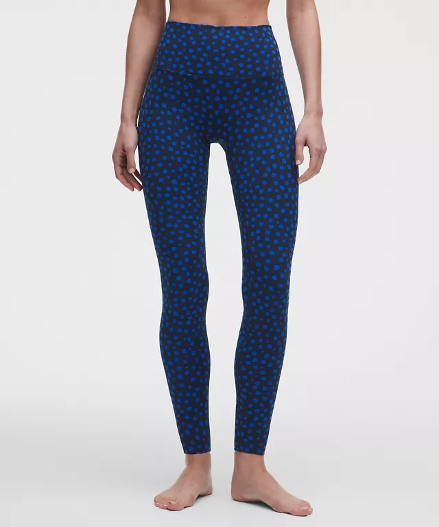
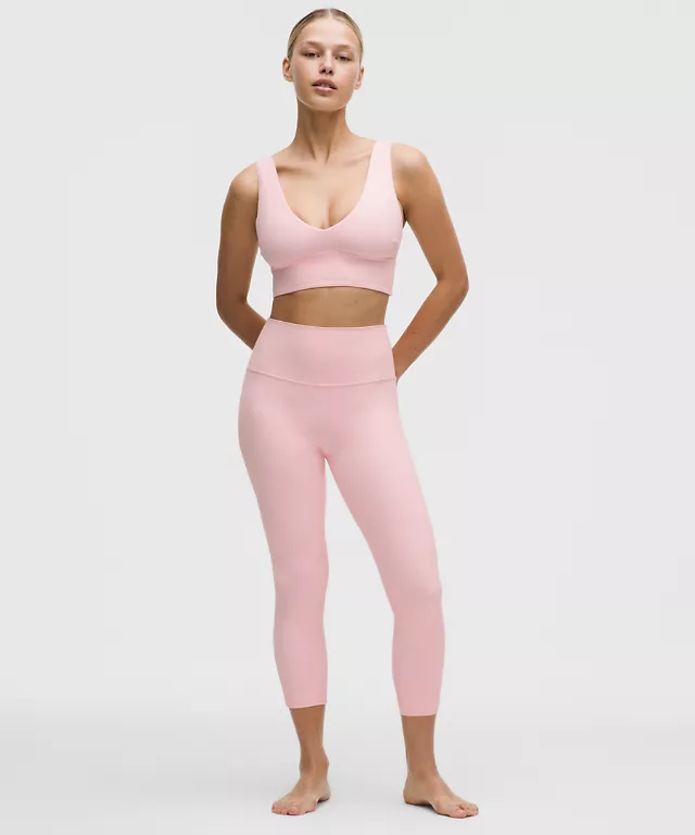
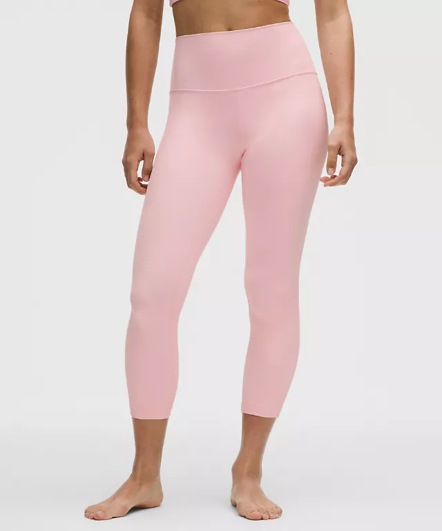
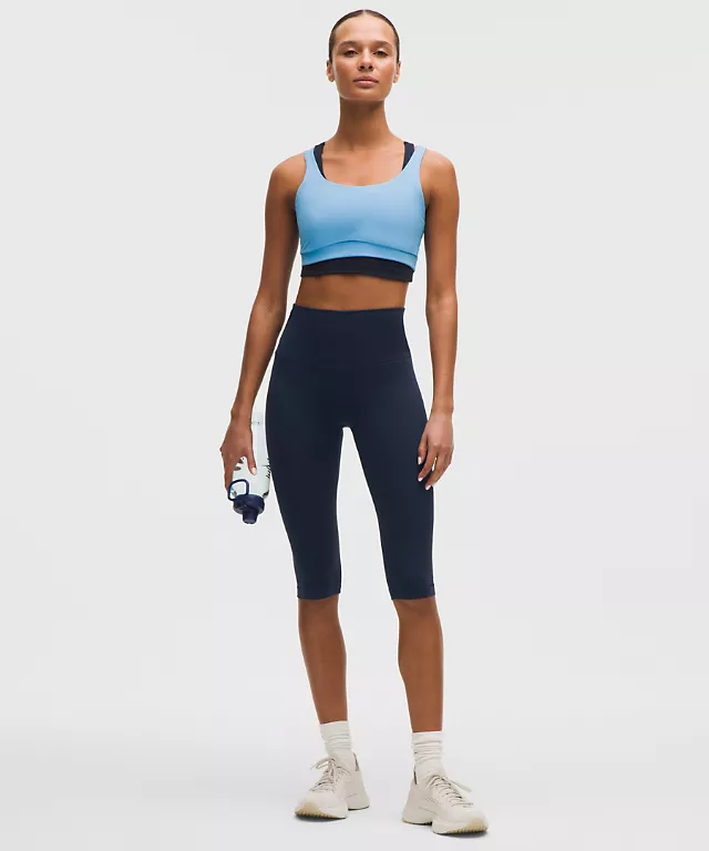
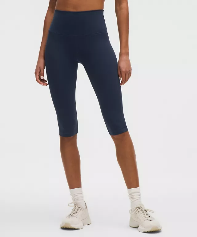
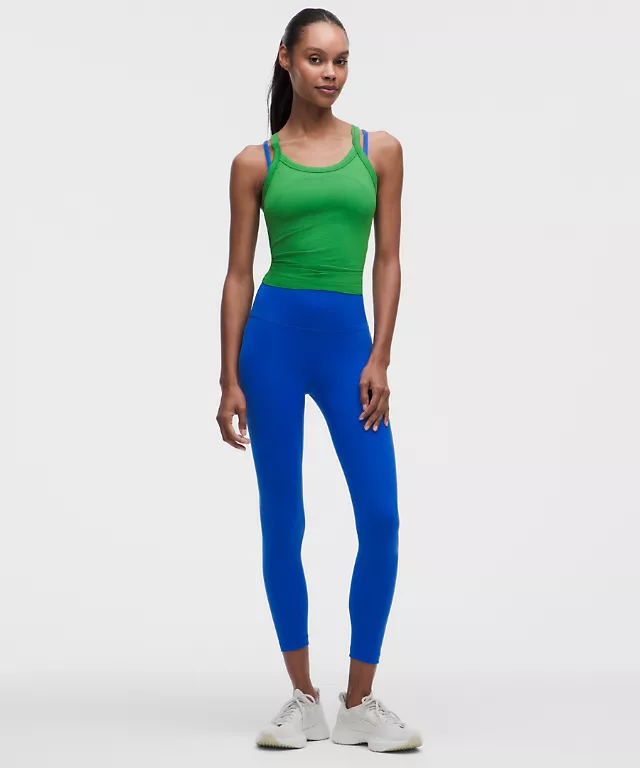
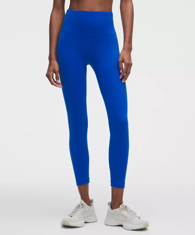
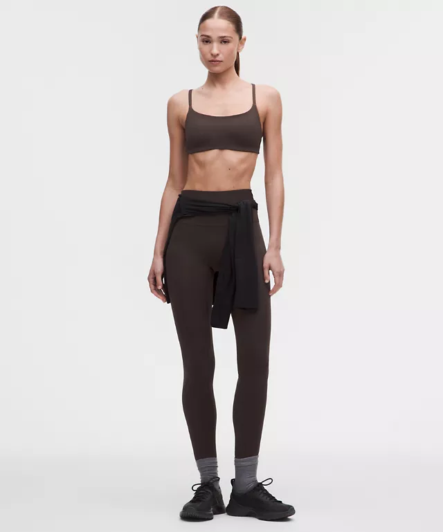
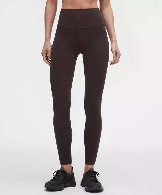
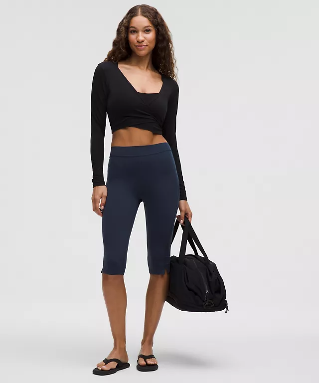
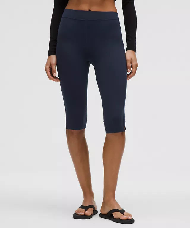
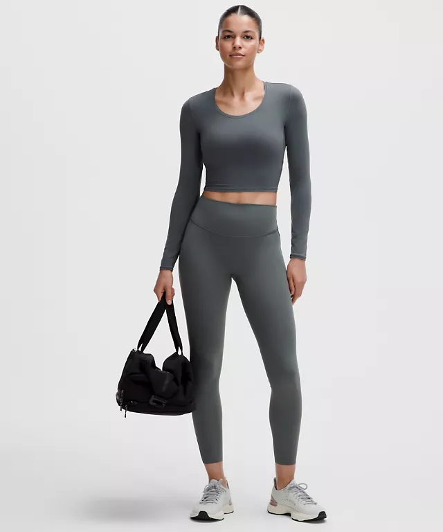
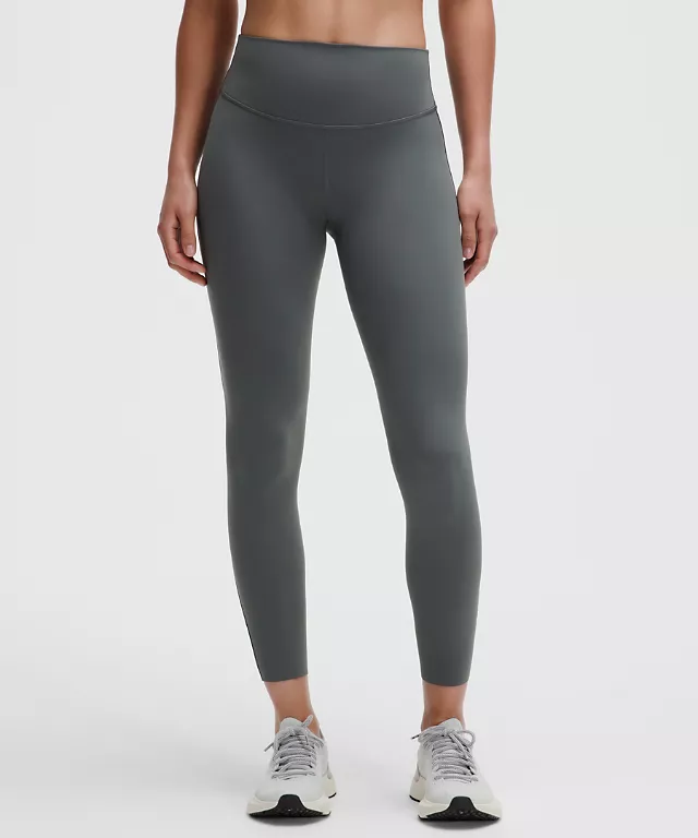
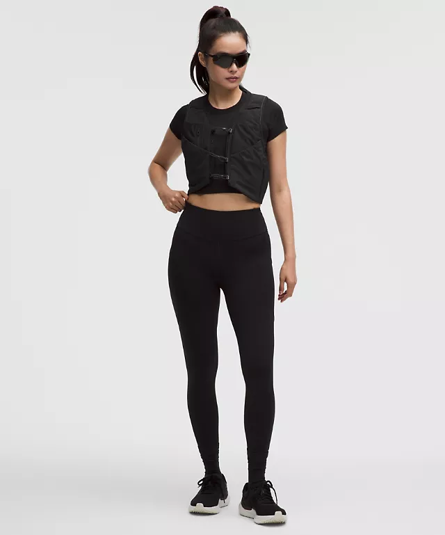
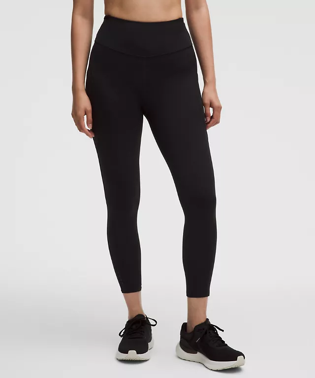
Image at 5/6 (measured: 720x864 on the source), second view on hover, name at 16px medium, price, swatches.
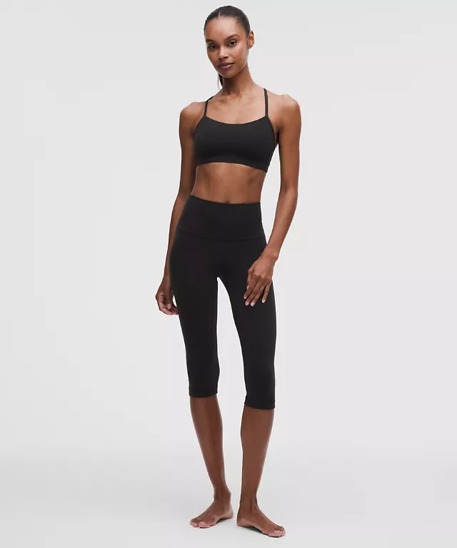
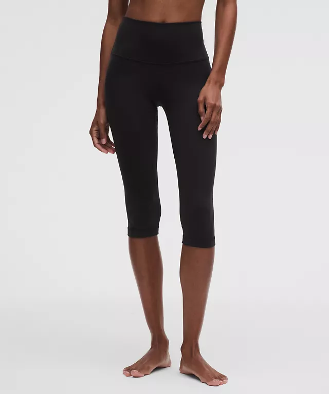
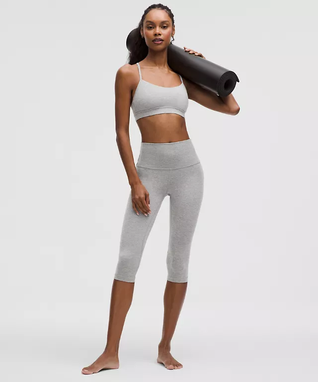
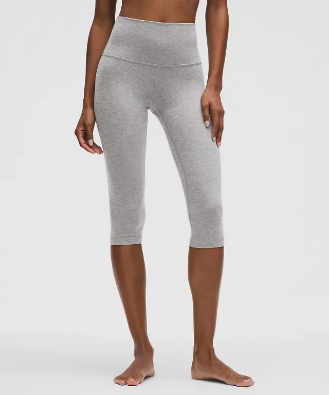
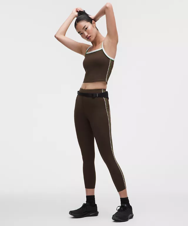
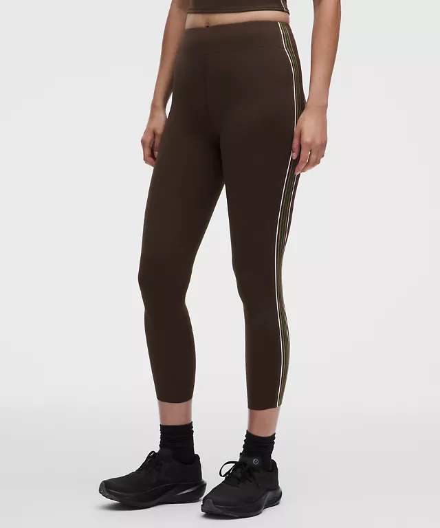
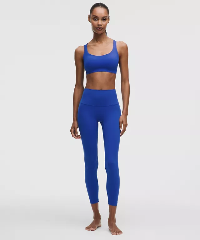
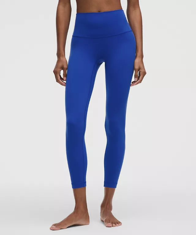
import { productTile } from '../components/product.mjs';
productTile(product, { compare: true })
Product grid
4 columns on desktop, 3 on tablet, 2 on mobile — derived from the sizes attribute of the source images (22vw / 31vw / 47vw).
Accordion
Used on the product page, the filters and the mobile footer. Animated with grid-template-rows, not max-height.
Fields & filters
Pill-shaped fields, checkboxes using accent-color, active filter chips.
Rating
Filled stars, numeric rating, link to reviews, distribution bars on the product page.